Lab Report · ACAD 274 / Data Systems

Gentrification.
Housing & Demographics in Los Angeles County

A study of demographic composition and income distribution across LA County — examined through the lens of displacement risk and housing affordability. Data sourced from the U.S. Census Bureau's American Community Survey.

9.76M
Total Population
3.49M
Households
$90,845
Median Income
$128,591
Mean Income

The data behind displacement.

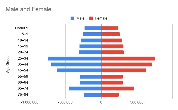
Los Angeles County is home to nearly ten million people — a sprawling region where gentrification reshapes neighborhoods block by block. To understand who stays and who is pushed out, we first have to understand who lives here and how wealth is distributed.

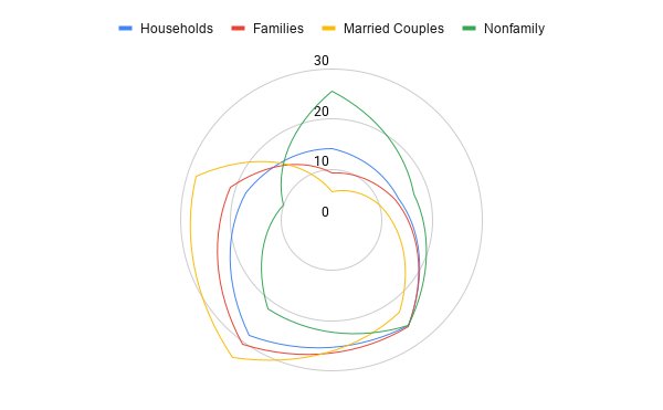
This report presents two core findings from our database: a demographic portrait of the county's age and sex composition, and an analysis of how income is distributed across four distinct household types. Together, they form the foundation for studying displacement patterns in subsequent milestones.

Who lives in LA County?

Population distribution by age group and sex.

Population pyramid of LA County showing male and female populations by age group
Figure 1. Population pyramid. Males shown on the left (negative axis), females on the right. The 25–34 cohort represents the largest single age group in the county, followed closely by 35–44.
Key Insight

LA County's population peaks in the prime working-age brackets of 25–44, with over 2.9 million residents concentrated in this range. This demographic weight drives demand for rental housing — and it is precisely these renters who face the sharpest exposure to gentrification pressure.

Table 1 · Age Distribution by Sex (estimated)
Age Group Male Female Total
Under 5234,820239,563474,383
5–9257,191262,386519,577
10–14288,861294,696583,557
15–19305,321311,490616,811
20–24307,794314,011621,805
25–34742,851757,8571,500,708
35–44697,682711,7761,409,458
45–54620,446632,9811,253,427
55–59298,164304,187602,351
60–64296,964302,963599,927
65–74450,922460,233911,155
75–84240,963245,830486,793
Total 4,826,069 4,931,110 9,757,179
Male/female splits estimated by applying the overall 49.5% / 50.5% ratio to each age cohort. Source: U.S. Census ACS via project database.

How is income distributed?

A profile of four household types across five income brackets.

Radar chart comparing income distribution across household types
Figure 2. Radar chart comparing income distribution across four household types. Each axis represents the percentage of that household type falling into the specified income bracket.
Reading the radar
  1. 1 Under $25K
  2. 2 $25K–$50K
  3. 3 $50K–$100K
  4. 4 $100K–$200K
  5. 5 $200K+
Key Insight

The four household types draw strikingly different shapes. Married couples (gold) bulge toward the high-income side — 28.3% earn $200K+. Nonfamily households (green) bulge toward the low-income side — 25.6% earn under $25K. This is the arithmetic of displacement: single renters and unrelated roommates bear a disproportionate share of housing vulnerability.

Table 2 · Income Distribution by Household Type (%)
Income Bracket Households Families Married Couples Nonfamily
Under $25K14.39.45.625.6
$25K–$50K13.913.210.017.0
$50K–$100K25.725.922.625.8
$100K–$200K28.130.433.521.6
$200K+17.921.228.310.2
Median Income $90,845 $102,498 $127,806 $61,622
Mean Income $128,591 $144,515 $173,090 $91,623
Highlighted cells mark extremes. Source: U.S. Census ACS via project database.

The cost is not evenly distributed.

Taken together, these two visualizations sketch a county where working-age renters and nonfamily households carry the greatest exposure to rising rents — even as married-couple families capture a disproportionate share of income.

In subsequent milestones, we will layer this demographic and economic data over neighborhood-level housing data to identify the specific census tracts where gentrification pressure is most acute.